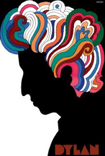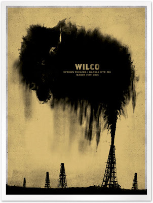
Our graphic design unit will cover the history of the poster as art, explore its elements and famous practitioners, and finally, each student will apply this knowledge and understanding with design and Photoshop skills to create a multi-media poster.

Whether promoting an event, a concert or theatrical performance, or to rally sentiment as a tool of propaganda, the poster's immediate goal is to catch the attention of the passerby, impelling them into action. We will be focusing on various heydays of posters from the late 1800's through today, their styles and their impacts, along with famous artists who have employed the poster as a medium for expression and profit.
From
Henri Toulouse-Lautrec's depictions of the 1890's Paris nightlife (“La Goulue Performing at Moulin Rouge” 1891) to
Art Nouveau and
Post Modern, the posters of
war and
propaganda, to current
movie,
concert, and
theater posters, the poster is a powerful force in the visual library of modern society. We will explore the poster as an art form and try to decode what elements make for successful poster design.

We will be covering the history and purposes of the poster in art + society for 1 week, concluding with groups of 2-3 students presenting various important time periods, genres or artists to the class.
The following 3 weeks will be devoted to the creation of your poster. Using Photoshop and Adobe Creative Suite, we will apply our understanding of poster history and effective design toward the creation our own poster. The subject matter of your poster can be theater/opera, concert, a literary work, promotion of the school or school event/club, or if you have an idea for something outside of these, we can talk about it. We will explore different tools and techniques and employ them to achieve impactful, eye-catching typography, texture, and design effects. I will be checking that you have at least 3 thumbnail concepts in your sketchbooks, from which you will select your favorite concept and then work out at least 3 solutions before selecting your final design.

You are going to be executing a mixed media poster, incorporating photography, artwork, and typography. You will need to show evidence of the use of at least 2 filters and the transform tool. You will need to employ an adjustment layer and a mask.
Finally, we will discuss the effectiveness of your posters through a class critique, where you will describe the purpose or concept behind your poster, give examples of your inspiration (style, artist, subject matter, etc.), describe some of the effects you employed, while defending and explaining your choices.
The class will follow the PSA format for comments during the critique:
P = something POSITIVE
S = SOMETHING you'd like to have seen done differently, or seen done better
A = how the piece AFFECTED you (how it makes you think or feel)
Upon completion of this unit, you will have a grasp of the poster's role in art and society since the 19th Century, effective poster design techniques and important artists and movements in the history of poster art. You will also be reflect this knowledge and your grasp of specific Photoshop techniques, in the creation of your own poster.
 Advertising is propaganda. Propaganda is advertising. 100 Years Of Propaganda: The Good, The Bad and The Ugly is a nice collection of the art and the artists who strive to direct public opinion and actions. What skills and strategies are commonly employed in both advertising and political propaganda? Are there commonalities in the use of color? What role does color serve in all four of these examples?


